Today I want to draw your attention to the visual aspect of information presentation.
The human brain is incredibly good at getting and interpreting visual information. We spent years in our high schools and universities analyzing graphs of functions and getting common with this form of information. A huge part of those charts has time on the X-axis, in this case, we have the value dependency on time. One extreme example of this approach is the so-called “black box” or flight recorder read-outs used in aircraft accident investigation.
Simplified sketch of a flight recorder readout
The key feature of black box red-outs is multiple charts on the same timeline. Values can be in different units of measure, which might be confusing in the beginning, because you cannot directly compare different metrics. But having things on the same chart makes it possible to see how different indicators correlate and you can get a multi-dimensional picture of the processes of the multifactor system.
People have been using those charts for decades to analyze the behavior of such a complex system as modern aircraft, so why don’t we use the same approach for the database analysis? And in my experience, it makes nothing but sense: you can get a real quick impression of the system behavior just by having a quick glance at such a chart.
Okay, now to SAP HANA
Luckily, SAP HANA already contains such a “flight recorder”. A lot of useful telemetry is collected by the nameserver and put into nameserver_history.trc file. This information is also available from m_load_history* views. And this data can be visualized for interpretation, which gives us easy access to the insides of the database behavior.
Standard nameserver telemetry includes such KPIs as memory usage, CPU utilization, disk and network activity, transactions, locks, and many, many more: it is ~50 (!) of them available for each SAP HANA service. This already gives quite detailed information on the database’s health. But the nameserver is limited to this decent yet fixed set of KPIs chosen by SAP engineers to be carefully collected every 10 seconds by every SAP HANA instance in the observable universe.
In some situations, we can benefit from having additional information on the screen based on other data sources like monitoring views, statistics service tables, or even business tables. And this can be done with custom KPIs.
There are three types of custom KPIs in RybaFish: Regular, Gantt, and Multiline.
Regular KPIs
Regular custom KPIs have the same principle as the standard ones: a measurement is done every moment in time. Unlike standard ones, regular custom KPIs are based on an alternative source of data (not m_load_history* views).
Gantt Chart
Thanks to Henry Gantt, we have a common way to visualize processes on timelines. And this could be an extremely informative way to show activities in such a noisy system as a corporate database.
Unlike the standard KPIs like memory usage or CPU consumption, processes have start and end times. Examples of processes are: delta merges, savepoints, abap jobs, internal threads, etc. But the most used one is the expensive statements.
Most of the activities in the database have a corresponding statement, and with proper trace configuration, the ones generating excessive resource consumption will be recorded in the expensive statements trace. What is recorded – can be visualized.
In this case, we see three users (DATALOAD, RIP_THE, TESTER) were executing statements in this timespan. It is very clear that statements executed by RYP_THE user are perfectly aligned with increased memory and CPU consumption. So, we know the user, the exact impact, and, if required, also the statement itself: in the application Gantt bars are clickable and you can see actual statement text.
This technique covers at least 80-85% of unusual activities in the database, and it is very convenient when you can get access to this information with just a mouse click.
Multiline
In some cases, the information has an additional “dimension” coming from the data source itself. This characteristic can be used in visualization to get additional information on the chart.
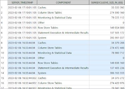
For instance, let’s have a look at aggregated host_heap_memory data. There is a “component” column that provides additional information on memory allocation purposes:
select server_timestamp, component, sum(exclusive_size_in_use)
from _sys_statistics.host_heap_allocators
where port = 30003
group by server_timestamp, component
order by server_timestamp desc, component;
Having this visualized, we will see the heap memory distribution between different components (row-store not included):
Now it is obvious that increased memory consumption is related to the “System” and “Column Store” components. What is also interesting: after each statement execution the System component drops to its baseline, but the Column Store component usually stays on a bit higher level, compared to the start of the statement execution. This already reveals a lot about this activity, but there is even more we can get from the very same diagram.
If we zoom in on the “Suspicious execution” after 07:30, we can see that there is an overlap with another statement, executed by the user named TESTER:
This user triggered two executions, and both times it resulted in memory usage spike up to the allocation limit.
What is also interesting here: after the first execution at 07:38:20 the memory consumption in the Column Store component decreased. Theoretically, there could be several reasons for that, but considering the memory usage spike up to the allocation limit – most likely it was a column unload event: HANA was trying to free up some memory in a desperate attempt to continue with the greedy statement. And this is confirmed by checking the Column Unload KPI (a spike of the pink line). In this particular case, both statements were terminated as victims of the out of memory event.
Note: standard nameserver KPIs are collected by the nameserver with higher granularity compared to Memory Components. By default, nameserver granularity is 10 seconds, memory components: 15 minutes. For the sake of this demo, those settings were adjusted to 1 second and 1 minute respectively.
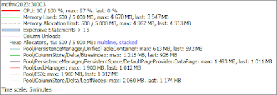
Not-aggregated information from the same source provides even deeper insight into the memory usage purpose: per memory category (so-called allocators):
Note: unlike the previous example, in this case, “stacked” visualization is used.


No comments:
Post a Comment