To address classification and regression machine learning scenarios, APL uses the Gradient Boosting technique. As for explaining what the predictive model does, APL relies on the SHAP framework (SHapley Additive exPlanations).
In this blog we will see how to extract and visualize SHAP values to obtain a:
1. Global explanation from the APL trained model.
2. Local explanation regarding an individual prediction.
Global Explanation
First, we define a HANA dataframe pointing to the training data stored in the database.
from hana_ml import dataframe as hd
conn = hd.ConnectionContext(userkey='MLMDA_KEY')
sql_cmd = 'SELECT * FROM "APL_SAMPLES"."INSURANCE_CLAIMS" ORDER BY "Id"'
hdf_train = hd.DataFrame(conn, sql_cmd)
We request a couple of claims and display them using a Pandas dataframe.
df = hdf_train.filter('"Id" in (1766,1832)').collect()
df.style.hide_index()
We learn from past insurance data including both fraudulent as well as genuine claims.
from hana_ml.algorithms.apl.gradient_boosting_classification import GradientBoostingBinaryClassifier
apl_model = GradientBoostingBinaryClassifier()
apl_model.set_params(other_train_apl_aliases={'APL/VariableAutoSelection':'true'})
apl_model.fit(hdf_train, label='Fraud', key='Id')
Now we can look at the importance of each input variable for predicting fraud.
from hana_ml.visualizers.unified_report import UnifiedReport
UnifiedReport(apl_model).build().display()
This global explanation is based on the method: ExactSHAP. The shap value for each variable is converted into a relative importance. All the calculations are performed on the database side. The total of all bars is equal to 1.
Some variables don’t appear in the chart. This is because they have been excluded by the APL automated selection. Here is the list of excluded variables with the reasons for exclusion.
df = apl_model.get_debrief_report('ClassificationRegression_VariablesExclusion').collect()
df = df[['Variable', 'Reason For Exclusion']]
df.style.hide_index()
Local Explanation
With the predict method, one can request the individual contributions (aka shap values) from the APL trained model. The score and the shap values are computed on the HANA database side.
apl_model.set_params( extra_applyout_settings=
{ 'APL/ApplyExtraMode': 'Advanced Apply Settings',
'APL/ApplyPredictedValue': 'true',
'APL/ApplyProbability': 'true',
'APL/ApplyDecision': 'true',
'APL/ApplyContribution': 'all' }
)
df_shap = apl_model.predict(hdf_train).collect()
dict = {'TRUE_LABEL': 'Target Actual',
'PREDICTED': 'Target Predicted',
'gb_score_Fraud': 'Score',
'gb_proba_Fraud': 'Probability',
'gb_contrib_constant_bias': 'Shap Baseline' }
df_shap.rename(columns=dict, inplace=True)
df_shap.columns = [hdr.replace("gb_contrib_", "Shap ") for hdr in df_shap.columns]
df_shap[df_shap['Id'].isin([1766,1832])].style.hide_index()
If you add together the shap values of the predictors and the shap baseline (last column), you will get the score (4th column).
col_list= [col for col in df_shap.columns if col.startswith('Shap')]
df_shap['Total Shap'] = df_shap[col_list].sum(axis=1)
df_shap[df_shap['Id'].isin([1766,1832])].style.hide_index()
That code snippet was only to illustrate the additive property of shap values.
Often business users are not comfortable with the score obtained from classification models (regression models are simpler from that standpoint because they predict a value in the unit of the target, for example euros if the target is an amount). The predicted score of our classification model is an unbounded value, hard to interpret. It can be used though to sort the claims from highest to smallest score; that way the claims that are most likely to be fraudulent will show first. One can also use the decision probability, ranging from 0 to 1. Let’s look at the relationship between the two.
import matplotlib
%matplotlib inline
import seaborn as sns
sns.relplot(x="Score", y="Probability", hue="Target Predicted", data=df_shap, height=2.2, aspect=1.3);
The score and the decision probability are related by the logit and sigmoid transforms:
◉ score = logit(probability)
◉ probability = sigmoid(score)
The blue segment of the curve being longer than the orange one, we are under the wrong impression that there are more Yes predictions than No predictions. In fact, there are many more orange claims than blue claims. Here is the distribution of the predicted target:
df_shap['Target Predicted'].value_counts(normalize=True)*100
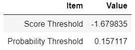
The threshold value to decide whether a claim should be classified as Fraudulent or Not fraudulent, is determined so that the ratio of yes predictions approaches the ratio found in the actual data during the learning phase. One can retrieve the threshold value in the score space and probability space.
df = apl_model.get_summary().filter("KEY like '%DecisionThreshold'").collect()
df = df[['KEY','VALUE']]
df['KEY'] = df['KEY'].str.replace('Apply', '').str.replace('Decision', ' ')
df['VALUE'] = df['VALUE'].astype(float)
df.columns = ['Item', 'Value']
df.style.hide_index()
An article about SHAP would not be complete without showing a force plot and a beeswarm plot.
We get ready for the shap visualizations.
from shap._explanation import Explanation
from shap.plots import force, waterfall, beeswarm
shap_columns = col_list[:-1] # Removing the total
predictors_names = [c[5:] for c in shap_columns] # Removing prefix Shap
shap_values = df_shap[shap_columns].values
actual_values = hdf_train.collect()[predictors_names].values
baseline = df_shap['Shap Baseline']
xpl = Explanation(shap_values, base_values=baseline, data=actual_values, feature_names=predictors_names)
We show below an example of force plot for a claim with a low score:
idx=df_shap[df_shap['Id']==1832].index.values.astype(int)[0]
force(xpl[0].base_values, xpl[idx].values, features=xpl[idx].data, feature_names=predictors_names, matplotlib=True)
A force plot for a claim having a high score:
idx=df_shap[df_shap['Id']==1766].index.values.astype(int)[0]
force(xpl[0].base_values, xpl[idx].values, features=xpl[idx].data, feature_names=predictors_names, matplotlib=True)
Don’t be surprised if you see two claims with, for example, the same Bodily Injury amount but different force values. The shap value includes actually the interaction with other predictors, it is composed of a main effect and an interaction effect.
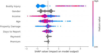
We conclude this blog with the famous beeswarm. That plot gives a summary view where each dot is an individual claim.
beeswarm(xpl, max_display=8)
You recognize the features we saw earlier in the variable importance bar chart. Note that the color gradient from blue to red does not apply to nominal variables (in grey) like gender or payment type.


No comments:
Post a Comment